#Quick Access Toolbar
Explore tagged Tumblr posts
Visit Tumblr Blog
Explore Tumblr blogs with no restrictions, modern design and the best experience.
Last Seen Tumblr Blogs


Fun Fact
Tumblr Inc. has $15.1M in annual revenue.
Text
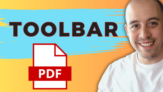
How to Adjust the Toolbar in Adobe Acrobat Pro DC
Learn how to customize the Quick Access Toolbar in Adobe Acrobat for a more efficient workflow. #AdobeAcrobat #Accessibility #QuickAccessToolbar #Customization #Efficiency
In today’s blog post, we’ll explore how to set up and customize the Quick Access Toolbar within the latest version of Adobe Acrobat. Let’s dive right in. Video Guide When you first launch the latest version of Adobe Acrobat, you may notice some changes in the interface. The tags panel now resides on the right-hand side, while the Menu Bar and tool elements are on the left-hand side. I find the…
View On WordPress
0 notes
Text
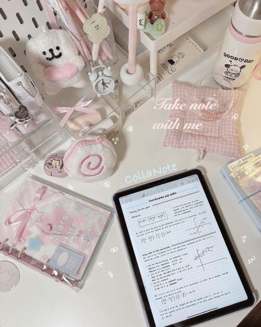
digital notes guide part 2/5: taking effective lecture notes (but make them cute!) 🎀


1st post
posted by: glowettee
hey study butterflies! ♡ mindyyyyy hereeeee
welcome back to our digital notes series! today i'm going more into the actual note-taking process during lectures/classes. this is important, since you can swap out notebooks for a digital notebook which becomes a lot more seamless.

♡ pre-lecture prep
because being prepared changes everything:
night before setup:
review previous notes (refresh your memory!)
pre-read lecture slides
create note template
set up quick-access tools
prepare questions
charge all devices
quick-access toolbar:
highlighting shortcuts
screenshot tool ready
recording software open
reference materials linked
custom stickers folder
favorite templates
♡ the actual note-taking method
this changed my whole study game:
(SUPER IMPORTANT) the butterfly method (my signature system):
main points in center
supporting details on left wing
examples on right wing
questions in antennae section
vocabulary in body section
connections in trail section
active engagement tricks:
use different colors for different types of information
create mini mind maps as you go
add little drawings for visual memory
insert voice memos for complex topics
flag confusing points with cute markers
leave space for post-lecture additions
♡ making it aesthetic but effective
because why not have both?:
visual organization:
use boxes for definitions
clouds for main concepts
stars for important points
hearts for memorable examples
arrows for connections
flowers for chapter markers
color coding system:
pink for main concepts
lavender for examples
mint for definitions
peach for formulas
baby blue for dates
gold for important warnings
♡ dealing with fast-paced lectures
because professors/teachers love to speed-talk:
shorthand system:
create cute abbreviations
use symbols for common words
develop personal code system
quick bullet points
voice record if allowed
flag for later review
quick capture methods:
screenshot important slides
quick sketch diagrams
voice memo key points
type keywords only
mark confusion points
flag for detailed review
♡ post-lecture enhancement
because the real magic happens after:
immediate review:
fill in gaps while fresh
add pretty headings
organize messy sections
insert relevant images
complete examples
link related concepts
enhancement techniques:
create summary boxes
add practice questions
insert related resources
make concept connections
highlight key points
add memory triggers
effective notes aren't just about capturing everything - they're about creating a resource you'll actually want to review! think of it like creating your own aesthetic textbook that speaks your language.
pro tip: don't try to make everything perfect during the lecture. focus on capturing information first, make it pretty later! i usually spend 15 minutes after each lecture prettifying my notes.
xoxo, mindy 🎀
#studynotes#lecturenotes#studywithrme#studentlife#studygram#notetaking#studying#digitalnotes#studytips#productivity#organization#girlblog#girlblogger#girlblogging#that girl#dream girl#it girl#self care#self love#glow up#becoming that girl#self help#self improvement#self development#study#studyblr#college#rory gilmore#study blog#studyspo
64 notes
·
View notes
Note
I appreciate you actually trying Ellipsis. I've seen it recommended, but no one has really given any examples of what it does. It's nice to see that there are different themes, which is helpful as someone who is light sensitive.
How is the feel of it? Does it feel intuitive?
I'm really enjoying it so far. There are plenty of interesting features I have yet to try out. There is apparently a new feature for exporting to AO3, for instance. And there are two dark modes and a sepia tone mode for those who are light sensitive.
It took a little poking around and trying different things to figure out the many draft options and how you compare changes and merge those, but I found it a lot more intuitive than some other word processors I've looked into, like Scrivener. And they do give you a guide when you start-up that is included in your projects homepage (I just like discovering things for myself), so there's that for reference if you do get stuck.
More pictures and rambling under the cut!
Here's the main homepage once you log in to your account. Here you can view all your different projects.

Mostly, everything looks very familiar once you get into the project. I find the screen to be a bit busy at first, but both side panels are collapsible. And then if you really want to pare things down, you can use focus mode. This is the teacup icon next to the word count, which isn't labeled unless you hover your cursor over it (a few buttons are like that).


The left panel is where you have your different drafts, basically different versions of the same document that you can change, compare, and later merge as you want. I'm really excited about this feature in particular because I love starting a dozen drafts of the same story and then later Frankenstein-ing them together.
The right panel is mostly for document settings and formatting (basically what Word and Google Docs put across the top of the screen) as well as exporting in various formats. The toolbar along the bottom is a quick access for your most commonly used formatting needs.

As you can see, focus mode takes that all away and really is just about a very seamless, clean view of your document. I find this great for working in. The lack of busyness helps me, personally, but I can still access the document outline (top right icon) from here for easy navigation.
It doesn't take you to a fullscreen view, though, which I've seen some other options do. I prefer this, because I like to listen to music as I write, and I don't want to be constantly switching back and forth from fullscreen to access my browser tabs and change music, pause, etc.
So yeah! I'd say try it out and see if you like it. It is still in beta, I believe, but I like their stance on generative AI. And it has so far made a good alternative to Google Docs, so we'll see how it goes as I continue using it and as they continue making changes!
12 notes
·
View notes
Text
↬ OC Verse Trading Cards
Here it is! The reason (well, one of the reasons) for why I've been so inactive lately. I saw this super cool trading card template by @squea and @buttertrait and thought it was super fun, so I wanted to make something similar for my mutuals and myself. And, as you can see, I rediscovered my love for art deco on the way, so it's very art deco lol

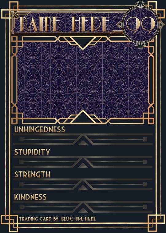

You can find the template to make your own cards here - and I explicitly encourage you to make your own, because I was kinda hoping I would get to see cards of you guys' OCs and we could collect them all in a binder like this one. It would be really fun! (The number next to the name is the power level btw - I wanted to imitate a set of Star Wars trading cards I used to collect as a kid) Make sure to @ me when you do and tag your post with #ocversetradingcards!
I tried to make the template as accessible as possible so that even beginners should be able to use it without any issues. So, I color-coded the layers!
The red layers are ones you shouldn't touch. They make up the main frame of the card. The orange layers are ones where you can play around with the colors, but that's for advanced photoshop/photopea users. The green ones are the ones where you put in text! Edit those freely. Blue ones are ones you have to select and move as a batch - if you don't know how to do that, check below the cut ^^
You'll need to download these fonts:
Park Lane (name & power level)
Market Deco (main text font)
Artisual Deco Black Italic (blog url)
Below the cut, you'll find a tutorial for the template and a list of the image resources I used - Quick info for everyone, including the more experienced Photopea users: Save your image at 50% quality. The template is a big file and the exported image will also be pretty big if you don’t save it at a lower quality. 50% is what you can see above and I think it's a nice size-quality ratio.
Tutorial Time
Opening the File
Step one: Get either Photoshop or Photopea. Photoshop costs money, Photopea is free and runs in your browser. Take three guesses which one I use. Yeah, it's Photopea. As such, this tutorial will be Photopea-centric, and I also have no clue what the Photoshop interface looks like, so I can't really help you if you work on Photoshop. But I'm told they're essentially the same, so...
Step two: Download the fonts listed above from the links in this post.
Step three: Click on the link above to go download the template. It's a bit of a big file, so I put it into a zip file for you. Don't worry, you don't need a special program to open it. Photopea will do that for you.
Step four: Open Photopea. Click on "File" -> "Open..." and select the "TradingCardTemplate" zip file.
Step five: Click "File" -> "Open..." again and select the zip files for the fonts. This will import them to Photopea. There are also preview images included in at least one of the zip files for the fonts, so just close the windows for those projects when they pop up by clicking on the little "x" next to their file name. You only need the "TradingCardTemplate.psd" tab to be open in your Photopea window.
Great! Now you're all set to edit!
Editing the name, power level and blog url
I decided to group these together because they function essentially the same way
Step one: Select the typing tool. It's the little "T" symbol in the toolbar on the left side of your screen.
Step two: Select the layer of the text you want to edit. The blog url one is in plain view. For the name and power ones, you need to open the corresponding folders first. They're the green layers in the folders!
Step three: Click on the text you want to edit. It's easiest to aim for the middle, that way you have the least chances of missing. The typing tool is a bit finicky with that sometimes, especially if the text is small.
Great! Now you can use your keyboard to delete the placeholder text and replace it with your own! The power level will only fit two digits and picking "00" will look bad. Your OC should have at least some power. They need it to breathe.
Changing the size of the name text
As you might be able to tell, the basic text size only works for fairly short names. So, you might have to make it smaller for your OC's name to fit
Step one: Enter your OC's name as described above.
Step two: Select the text as you would anywhere else in your browser.
Step three: Above the little tag where it says "TradingCardTemplate.psd", there's an options bar. You'll find a box there labelled "Size" with a box that says "150px" and a down arrow next to it. Click on the down arrow and a slider will pop up. Play around with that slider until your text has a good size. Then click on the checkmark.
Step four: Switch to the transformation tool. It's the cursor with the directional cross next to it, at the top of your left-hand tool bar. Move your text so that it aligns well with the left side of the frame but make sure it's below the middle.
Step five: You now have to select two layers at once. The text layer and the frame for the name tag. Do do that, either press and hold your control key on your keyboard while selecting the other layer or toggle the control key using the on-screen keyboard at the bottom left of the toolbar. If you use the toggle, don't forget to untoggle it after.
Step six: On your horizontal toolbar above your project window, click on the icon that's a horizontal line with two boxes centered on it.
Congrats, your text should now be centered!
Adding in your OC picture
Step one: Open the "Picture" folder and select the layer beneath "Add picture here". This will make sure your picture will be in the right spot. Also make sure to click on the eye next to the "Pattern" layer tag to make it go invisible.
Step two: Select "File" -> "Open & Place..." and pick a nice image.
Step three: Once the image has been imported, make sure you change the zoom percentage to 100%, that way the image doesn't look pixely or weird. Click on the checkmark.
Step four: Resize your image so your OC fits nicely into the frame. The image should fill the entire space inside the frame and can stick out as much as you want.
Step five: Right-click (or press and hold, if you're on mobile) your image' layer and select "Clipping Mask".
Perfect! Now your image should no longer stick out of the frame. Feel free to adjust your image's coloration, brightness etc. by selecting "Image" -> "Adjustments" and your preferred action.
Changing your stats bars
This works the same for each bar and I tried to make it as simple as possible.
Step one: Open the corresponding folder.
Step two: Select the set of three blue layers together. You can do this by selecting one layer normally, then selecting the other two while holding your control key or while having it toggled using the built-in on-screen mini keyboard at the bottom left of your screen. If you use the toggle, don't forget to untoggle it after.
Step three: Switch to the transformation tool (the one at the top of your left-hand toolbar, it's a cursor with a directional cross) and move your layers. By moving them to the right, you'll reveal more of the gold underneath the overlay. More gold = higher level of the corresponding stat.
Great job! Now adjust the bars to your liking.
Saving your project + card image
To save the project: Click on "File" -> "Save as PSD". This will download the current project under the same name as the file that you downloaded it as. So, it will be called "TradingCardTemplate (1)" or something similar. Make sure you change the name in your files so you know which is which. Alternatively, you can also change the name of the project by double-clicking the little square that currently says "TradingCardTemplate" and type in your new name. If you save again now, it will show the new project name! Make sure to save your project if you want to be able to recover it and/or work on it later!
To save the card image: Click on "File" -> "Export as >" and pick your preferred image file type. I suggest JPG for best results. Make sure to turn the quality slider to 50%, then hit the save button. This will download an image file of your chosen type, under the same name as the project name. To change that name, refer to the bullet point above or go to your files :)
Advanced: Changing the BG color of the pattern
Step one: Select the pattern background of either the name tag, power score or picture and turn it to 100% opacity.
Step two: Color-pick the current background color of the pattern.
Step three: Click "Image" -> "Adjustments" -> "Replace Color..." and click on the colored rectangle in the new pop-up. Replace the default color with your color-picked color. Now use the Hue, Saturation and Lightness sliders to get a new color that you like. Note down your slider values for later so you have them for the other elements.
Step four: Color-pick your new color and select the corresponding solid background layer. For those layers, click "Edit" -> "Fill..." and make sure you have "Foreground" and "Normal" selected, your Opacity is 100% and you have "Preserve Transparency" checked.
Step five: Don't forget to turn the opacity of your pattern layers back down to 60%.
Congrats! You have your colors changed! Repeat this process for the other two patterned elements.
Extra advanced: Changing the card's background color
NOTE: I DON'T recommend this. You can do it, but it's a lot of work.
Step one: Select the background layer and change its color to the new color you want. You can do it with the "Hue/Saturation..." adjustment, with the "Fill" edit as described above, or whichever way you want. Color-pick your new color.
Step two: Open the smart object PSDs for the frames for the frames for the picture, the name tag, and the power counter by double-clicking on the preview image of the layer.
Step three: Select the lowest colored layer of each and change its color to the same as your new card background color. Click on "File" -> "Save (Smart Object)". Close the project windows.
Step four: Open the folders for the various stat bars and select the "Color Overlay" layers. Change their colors the same way you did for the other layers. Warm colors and high-saturation colors will most likely not look good here and you might need to find a different way of making the stat bars look good. Playing around with the "Brightness/Contrast" adjustment layers above might help, but I can't promise anything. This is the main reason why I don't recommend changing the card background color. The stats bars are adjusted to the background color.
There we are! Either your card looks very pretty now or you understand why I don't recommend this. Either way: Good job!
Resources from Freepik:
Corners by tartila Power counter frame Picture frame by pch.vector Stats bar by tartila Pattern

Taglist (we're bringing out all fandoms today): @starcrossedjedis @oneirataxia-girl @daughter-of-melpomene @bravelittleflower @box-of-bats @fluffle-system @wheresmybloodynauglamir @nanukanal @supermarine-silvally @cody-helix02
#ocversetradingcards#artsy#photopea adventures#oc: akaito coraline#oc: helena#holy freaking shit i finally did it#look everyone!!!
21 notes
·
View notes
Text
WHY ID I CHNAGE MY ANSWER RAHHHHH QUICK ACCESS TOOLBAR WHYYYYY I SHOULDVE TRUSTED MY GUTSSSSS
13 notes
·
View notes
Text
if you don't use ur browser's built in bookmarks bar i highly recommend it tbh. i used bookmarks all the time as a kid but stopped as social media took over and it felt less necessary. but then this year i remembered how useful they are and started using them again and it really motivates me to leave my comfort zone on only a handful of websites and also! means i don't forget!! where my shit is!!! i have a resources folder full of. well. resources. and my main toolbar has quick access links to stuff i visit really often but not enough for it to instantly appear when i start typing it into the URL bar. it's great
11 notes
·
View notes
Text
How to See Resistance and Support in TradingView

In the world of trading, the concepts of resistance and support levels are fundamental to understanding market movements and making informed decisions. TradingView, a popular charting platform used by traders worldwide, offers a comprehensive set of tools and indicators to help traders identify these critical levels. Here's a guide on how to see resistance and support in TradingView:
Step 1: Choose Your Chart First, select the asset you want to analyze on TradingView. You can do this by entering the name or ticker of the asset in the search bar at the top of the platform.
Step 2: Select the Timeframe Choose an appropriate timeframe for your analysis. Timeframes can range from 1 minute to 1 month, depending on your trading strategy. Short-term traders might prefer shorter timeframes, while long-term investors might look at daily or weekly charts.
Step 3: Use Trend Lines To identify resistance and support levels, you can use the Trend Line tool in TradingView. Click on the Trend Line icon (it looks like a diagonal line) in the toolbar on the left side of the screen. Then, draw a line connecting the price highs to identify resistance, and another line connecting the price lows to identify support.
Step 4: Apply Horizontal Lines For more defined levels, use the Horizontal Line tool in the toolbar. Place a horizontal line at a price level where the asset has shown difficulty in moving above (resistance) or below (support). These levels often indicate where buyers or sellers are concentrated.
Step 5: Incorporate Indicators TradingView offers various indicators that can help identify resistance and support levels. The Moving Average, Fibonacci Retracement, and Volume Profile are popular choices. To add an indicator, click on the "Indicators" button at the top of the screen and search for the one you want to use.
Step 6: Analyze Price Action Pay attention to how the price reacts around these levels. Resistance or support is confirmed when the price bounces off these levels multiple times. The more times the price touches these levels without breaking through, the stronger they are considered.
Step 7: Monitor Breakouts or Breakdowns A breakout (price moves above resistance) or breakdown (price moves below support) can signal a potential trend change. Use TradingView's alert system to notify you when the price crosses these critical levels.
Exploring TradingView Alternatives: FastBull
While TradingView is a popular choice among traders, it's always beneficial to explore alternatives. FastBull is an emerging platform that offers a range of features for market analysis. Here's what makes FastBull stand out:
User-Friendly Interface FastBull is designed with simplicity in mind, making it accessible to both novice and experienced traders. Its intuitive interface allows for easy navigation and quick access to essential features.
Advanced Charting Tools FastBull provides advanced charting capabilities similar to TradingView, including a variety of chart types, drawing tools, and technical indicators, enabling comprehensive market analysis.
Real-Time Data and Alerts The platform offers real-time market data and customizable alerts, ensuring traders stay updated with the latest market movements and can react promptly to trading opportunities.
Social Trading Features FastBull incorporates social trading elements, allowing users to follow and interact with other traders. This community aspect can offer valuable insights and foster a sense of camaraderie among users.
Educational Resources For those looking to expand their trading knowledge, FastBull provides a wealth of educational content, including tutorials, articles, and webinars, catering to all levels of experience.
Mobile Accessibility Recognizing the need for on-the-go access, FastBull offers a mobile app that delivers the full functionality of its desktop platform, ensuring traders can monitor the markets and execute trades from anywhere.
Conclusion
while TradingView remains a top choice for many traders, platforms like FastBull are providing compelling alternatives that cater to the evolving needs of the trading community. Whether you stick with TradingView or explore FastBull, the key is to use the tools and resources available to enhance your trading strategy and decision-making process.
2 notes
·
View notes
Text
ahhh yeah that's a very specific browser issue with opera gx since they kinda went weird with their design. that doesnt happen with other browsers. and after a quick lookup, apparently opera gx is rather... un-intuitive when it comes to the toolbar design and layout and lots of people have issues accessing their extensions
was it the issue where you gotta like hover over or click the "extension bubble" thing? because apparently they updated it recently to hide all by default which is kinda dumb kmfnlxmrlnkmrn
but yeah nw once you get the filters tab you can just slap the pastebin i made into it and try it out
wikipedia no longer being anywhere near the top of search results when looking up anything feels eviscerating
115K notes
·
View notes
Text
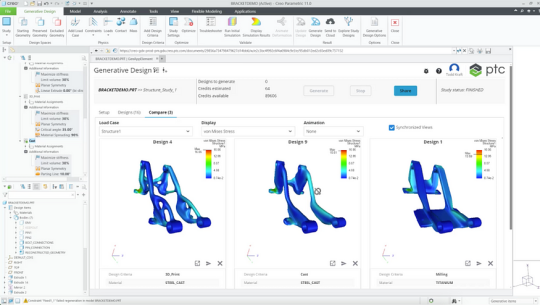
PTC Creo 12: New Tools for Smarter, Faster 3D Design
Discover what’s new in PTC Creo 12 — enhanced simulation, AI-driven design, MBD, and manufacturing tools. Upgrade now with ANH, the trusted PTC Creo reseller in the Delhi NCR region.
Top New Features in Creo 12
1. AI-Driven Design Guidance
Creo 12 takes intelligent design to the next level with built-in AI tools that offer real-time suggestions and improvements.
Get feedback during modeling
Reduce trial-and-error
Improve efficiency with every click
2. Enhanced Model-Based Definition (MBD)
Creo 12 makes MBD more practical and powerful, eliminating the need for traditional 2D drawings.
Improved PMI (Product Manufacturing Information)
Better GD&T annotation support
Clearer data for downstream users

3. Performance & Usability Upgrades
PTC has improved the overall speed, responsiveness, and ease of use:
Faster model regeneration
Smart mini toolbars
Enhanced model tree filters
Customizable dashboards for quick access

4. Creo Simulation Live — More Powerful Than Ever
Simulation Live has been expanded to cover:
Structural & thermal simulations
Better support for nonlinear materials
Real-time design feedback

5. Advanced Multi-Body Design
Creo 12 makes it easier to work with complex parts and assemblies:
Better control over multiple bodies in a single part
New body operations and organization tools
Improved part-to-part interactions
It’s ideal for high-detail engineering and intricate product development.
6. Additive and Subtractive Manufacturing Enhancements
Manufacturing has never been smoother in Creo:
More control over lattice structures
Enhanced 5-axis CAM functionality
New machine support and output formats
Whether you’re 3D printing or using CNC, Creo 12 has you covered.
7. Improved ECAD–MCAD Collaboration
With electronics becoming a bigger part of mechanical products, Creo 12 improves:
PCB visualization
Layer management
Synchronization between electrical and mechanical teams
This helps avoid costly errors during development.
Why Creo 12 is a Must-Have Upgrade
PTC Creo 12 isn’t just for big enterprises — it’s built for everyone who values smart, high-quality design. Whether you’re a design engineer, manager, or product innovator, Creo 12:
Saves time
Reduces errors
Encourages innovation
Supports industry 4.0 goals
Get Creo 12 from Delhi NCR’s Trusted PTC Reseller — ANH
Looking to upgrade your CAD tools or switch to Creo 12? ANH is a leading authorized PTC reseller in the Delhi NCR region. From licensing to training, we help businesses unlock the full potential of Creo.
Contact ANH today to get started with Creo 12!
✅ Conclusion: Welcome to the Future of Design
PTC Creo 12 is more than just an upgrade — it’s a gateway to smarter design, quicker development, and stronger innovation. With new AI tools, advanced simulations, and seamless usability, it’s built to give your team a competitive edge.
Design faster. Design smarter with Creo 12.
0 notes
Video
youtube
How to Enable or Disable the Bookmarks Bar on the Zen Web Browser
Need to clean up your browsing space or get quicker access to your favorite sites? In this tutorial, you'll learn how to display or remove the bookmarks bar (also called the favorites bar) in the Zen Browser using a PC. Whether you want a minimal view or quick bookmarks access, this step-by-step guide walks you through the simple process.Perfect for both new and experienced Zen Browser users!Simple Steps1. Open the Zen web browser.2. Click on the 3 Dot hamburger menu in the upper right corner and choose "Bookmarks".3. Towards the top of the new dropdown, choose either "Hide Bookmarks Toolbar" or "Show Bookmarks Toolbar".
0 notes
Text
SEO Meta in 1 Click: A Comprehensive Guide to Efficient On-Page SEO Analysis
In the dynamic world of digital marketing, on-page SEO remains a cornerstone for achieving higher search engine rankings. One tool that has garnered attention for simplifying on-page SEO analysis is SEO Meta in 1 Click. This guide delves into its features and benefits and explains how it can be a game-changer for your SEO strategy.
What is SEO Meta in 1 Click?
SEO Meta in 1 Click is a free tool that provides a comprehensive overview of a webpage's SEO metadata. With a single click, users can access critical information such as meta titles, descriptions, headers, images, links, and more, all presented in an organized manner. This tool eliminates the need to inspect page source code, making SEO analysis more accessible and efficient.
Key Features of SEO Meta in 1 Click
H2: Summary Tab
The Summary tab offers a snapshot of essential SEO elements:
Meta Title and Description: Displays the page's title and meta description along with their character lengths, helping ensure they meet SEO best practices.
URL and Canonical Tags: Shows the page URL and any canonical tags, aiding in duplicate content management.
Meta Robots Tags: Indicates directives for search engine crawlers, such as index or noindex.
H2: Headers Tab
This section outlines the hierarchy of heading tags (H1 to H6) used on the page. Proper structuring of headers is crucial for content readability and SEO.
H2: Images Tab
The Images tab provides insights into:
Total Images: Counts all images present on the page.
Images Missing Alt Text: Identifies images lacking alternative text, which is vital for accessibility and SEO.
Images Without Title Attributes: Highlights images missing title attributes, which can enhance user experience.
H2: Links Tab
This tab analyzes the page's linking structure:
Total Links: Displays the number of hyperlinks on the page.
Internal and External Links: Differentiates between links pointing within the same domain and those leading to external sites.
Links Without Titles: Identifies links missing title attributes, which can provide additional context to users.
H2: Social Tab
The Social tab checks for the presence of social media metadata:
Open Graph Tags: Ensures the page is optimized for sharing on social platforms.
Twitter Cards: Verifies metadata for Twitter sharing, enhancing content appearance on the platform.
H2: Tools Tab
This section offers quick insights into additional SEO checks:
PageSpeed Insights: Evaluate page loading speed and performance.
Mobile-Friendly Test: Check the page's responsiveness on mobile devices.
Structured Data Check: Validate the implementation of structured data on the page.
Read Also:- Free Directory Submission Sites 2025: Boost Your Website Ranking With The Latest List
Benefits of Using SEO Meta in 1 Click
H3: Time Efficiency
By consolidating critical SEO information into a single interface, the tool saves time compared to manually inspecting each element.
H3: User-Friendly Interface
The organized layout and intuitive design make it accessible for both beginners and experienced SEO professionals.
H3: Immediate Insights
Instantly identify SEO issues such as missing meta tags, improper header structures, or absent alt texts, allowing for prompt corrections.
How to Install and Use SEO Meta in 1 Click
H4: Installation Steps
Open the Chrome Web Store.
Search for "SEO Meta in 1 Click."
Click on "Add to Chrome" and confirm the installation.
H4: Using the Extension
Navigate to the webpage you wish to analyze.
Click on the SEO Meta in 1 Click icon in the Chrome toolbar.
Review the displayed SEO information across various tabs.
Who Should Use SEO Meta in 1 Click?
H5: SEO Professionals
For quick audits and on-the-fly analysis during client consultations or competitor research.
H5: Content Creators
To ensure their content is optimized with appropriate meta tags and header structures.
H5: Web Developers
For verifying the implementation of SEO best practices during website development.
Limitations to Consider
While SEO Meta in 1 Click is a powerful tool, it's essential to acknowledge its limitations:
Browser Dependency: Being a Chrome extension, it's limited to users of the Chrome browser.
Surface-Level Analysis: The tool provides an overview but doesn't replace comprehensive SEO audits.
No Keyword Analysis: It doesn't offer insights into keyword performance or competition.
Conclusion
SEO Meta in 1 Click stands out as an invaluable tool for anyone looking to streamline their on-page SEO analysis. Its ease of use, comprehensive data presentation, and immediate insights make it a must-have tool for SEO professionals, content creators, and web developers alike.
While it doesn't replace in-depth SEO tools, it serves as an excellent starting point for quick evaluations and ensuring that fundamental SEO elements are in place.
0 notes
Text
Use Pencil to Edit PDFs on iPad: The Ultimate Productivity Combo
If you’ve ever tried editing PDFs on your iPad, you know that typing and tapping can only go so far. But with the Apple Pencil, editing PDFs becomes fast, fluid, and incredibly precise. Whether you're signing contracts, highlighting lecture notes, or annotating business reports, using Pencil to edit PDFs on iPad turns your device into a powerful digital workstation.
In this blog, we’ll explore how to fully unlock the potential of the Apple Pencil for PDF editing — including tools, apps, and pro tips that will streamline your workflow.
Why Use Apple Pencil to Edit PDFs on iPad?
The Apple Pencil wasn’t just made for artists — it’s a productivity powerhouse for document editing. Here’s why:
🖋️ Natural Precision: Write, highlight, or draw exactly as you would on paper.
📋 Instant Edits: No need for a keyboard — make quick notes, markups, and signatures.
📱 On-the-Go Power: Edit and manage PDFs from anywhere, whether in a classroom, office, or on a plane.
💡 Paperless Efficiency: Skip printing and scanning — everything is digital, fast, and organized.
What You Need to Get Started
Before you start editing PDFs with Apple Pencil, make sure you’ve got the right setup:
✅ iPad: Any model that supports Apple Pencil (iPad 6th gen or later, iPad Pro, Air 3rd gen or later)
✅ Apple Pencil: Gen 1 or Gen 2 depending on your iPad model
✅ PDF Editing App: An app that fully supports Pencil input (more on that below)
Best Apps to Use Pencil to Edit PDFs on iPad
Not all PDF apps are created equal when it comes to Apple Pencil functionality. Here are some top recommendations:AppWhy It’s GreatPDF 7All-in-one editor: annotations, text edits, form filling, signatures — fully optimized for Apple PencilGoodNotesBest for students and handwritten notes on PDFsPDF ExpertGreat for professionals managing large documentsNotabilityIdeal for blending handwriting, audio, and sketches in PDF notes
If you’re looking for the most seamless experience, PDF 7 is built from the ground up to work beautifully with Apple Pencil.
How to Use Pencil to Edit PDFs on iPad
Let’s walk through how to use your Apple Pencil to handle every kind of PDF task:
✍️ 1. Annotate with Ease
Just open your PDF in a compatible app, grab your Pencil, and start marking:
Highlight text with a swipe
Underline or circle key points
Draw arrows or shapes to point things out
Jot down notes in the margins
📝 2. Fill Out Forms
Interactive PDFs? No problem. Use your Pencil to:
Tap into text fields and write by hand
Check boxes or initial forms
Submit right from the app
✒️ 3. Sign Documents Instantly
Gone are the days of printing and scanning. With Apple Pencil:
Open the PDF in an editor like PDF 7
Tap the signature tool
Sign naturally using Pencil
Save or send — all in under a minute
🔧 4. Edit Text (Yes, Actual Text)
Some PDF editors — like PDF 7 — allow direct text editing. Simply:
Select the text block you want to change
Use Pencil to highlight or delete
Type or handwrite new content
Pro Tips for Smoother Editing with Apple Pencil
Make the most of your Apple Pencil by using these smart tips:
🔒 Enable Palm Rejection This avoids accidental marks from your hand while writing.
🔍 Zoom In for Detail Work Perfect for small annotations or fine-tuning your signature.
💾 Use Cloud Storage Apps with iCloud, Dropbox, or Google Drive integration make saving and accessing your work seamless.
🎯 Customize Your Toolbar Set up quick access to your favorite tools — highlighter, pen, shape tool, etc.
Who Benefits Most from Using Pencil to Edit PDFs?
📚 Students – Annotate textbooks, add notes to slides, highlight lectures 💼 Professionals – Sign contracts, review proposals, mark up reports 🧠 Creatives – Sketch wireframes, give visual feedback, hand-draw edits 📄 Everyday Users – Fill out forms, sign documents, organize paperwork
If you're working with PDFs in any capacity, the Pencil-iPad combo is a total game-changer.
FAQs: Pencil to Edit PDFs on iPad
Q: Can I edit PDF text using Apple Pencil? Yes, with apps like PDF 7, you can highlight text, delete, and even write in new text directly on the document.
Q: Which is the best app to edit PDFs with Pencil on iPad? PDF 7 is highly recommended for its full suite of editing tools and flawless Pencil support.
Q: Is Apple Pencil better than finger or keyboard for editing PDFs? Absolutely. The Pencil allows for precise edits, natural handwriting, and faster annotations than typing or tapping.
Q: Can I use Pencil on free PDF apps? Yes, but premium apps offer better precision, features, and cloud sync options.
Final Thoughts
Using Pencil to edit PDFs on iPad makes document management easier, faster, and more natural than ever before. Whether you’re a student, professional, or anyone who works with PDFs regularly, this combination lets you interact with your documents in a way that feels truly hands-on — but with all the benefits of going fully digital.
So grab your iPad, connect your Apple Pencil, and start editing smarter today.
0 notes
Text
computer woes. this morning my laptop needed to be restarted in order to wake up. this happens about once a week, and is a PITA but usually everything comes back if I give it time. This morning... "restore session" worked... sortof... except, aaaaaalllllll my bookmarks are gone, history zilch, not even a functioning bookmarks bar or ability to make a new bookmark. "for quick access, place your bookmarks here on the bookmarks toolbar" yeah, I had done that, but now they are all pffft and I can't put them there, nothing happens. SIGH. good thing I have a "current tabs" document where I used to dump all my current tabs before doing a restart. at least a few things were there. and I have used things like this and dreamwidth recently enough to still be logged in when I search them up. But allll my gobotany bookmarks from last summer are vaporized. I knew I should have done a proper full backup some time at the beginning of the year. SIGH.
anyway. just venting. I will survive, but my trust in tech is down the tubes. do I even want to get another machine when this one doesn't come back from a restart?
0 notes
Text

MS Office Legal and Corporate - That’s How You Know…
Scenario: We are given a rather large document filled with Defined Terms (“NYSE”) as an example. As you know, Defined Terms establish a “short cut” so that after using the full term such as in our example “New York Stock Exchange” after the first full mention, we define it and for the remainder of the document, we can refer to that entity in its shortened form thus the use of (“NYSE”). The document was submitted with heavy edits to be done.
During the course of editing, the operator came across the request to please change all the Defined Terms to Bold Italic instead of the current Bold Font. There was numerous instances and the operator started looking for them one by one and making the requested change.
Another operator asked whether the Defined Terms were done with Character Styles or with Direct Formatting. “How would I know” responded the person doing the edits.
We can quickly ascertain the answer in a few ways. One way, is to load your “Style Box” on your “Quick Access Tool Bar” Go to File, Options, Customize Quick Access Tool Bar, change Popular Commands over to “All Commands” and look for the word “Style” by itself with no icon to the left of the word style. Add it to the right side panel of your Customize Quick Access Toolbar Window, and it will now appear on your Quick Access Toolbar.
The other way is to bring up your Apply Style Toolbar “Control Shift S”. This will give you a style box at the top window as well. Yes, you can see what style your right side panel jumps to as well.
Here is how you know whether character styles were used:
If you place your cursor within a paragraph that contains a Defined Term using an attribute such as bold, your style box will show the name of your Paragraph Style initially when placing the cursor on non Defined Term material.
If you then click on one of your Defined Terms the style name should now switch to the “Character Style” being used to bold the term. If there was no Character Style used on the Bolded Defined Term meaning “Direct Formatting” was used, then the style box will continue to show the Paragraph Style only.
If a Character Style was used to Bold all of the Defined Terms then we would simply modify the style and in our case, change it from Bold to Bold Italic and all instances throughout the document would change right away. You would also want to update the name of the style to show the added attribute to the modified style such as Bold-Italic Defined Term.
Note: Yes, you can do a global to take care of this but you have to be comfortable with wild cards. I did cover this in my wild card book MS Word Legal - Search, Replace and Wildcards which can be found on Amazon under my name. Either way, you should be familiar with the concepts that were covered in this article and it is a good thing to have the style box on your Quick Access Toolbar to serve as an easy way to always know the style your cursor is resting within.
Training From An Inside Perspective for Secretaries, WP Operators, Paralegals, Law Students, Administrative Assistants, Attorneys and Business Professionals
We also do test prep and help with placement. Don’t lose out on a great opportunity! Make sure your skills are at their best.
888-422-0692 Ext. 1 and 2
www.advanceto.com
https://advancetoffice.com/
www.awalkinthecenter.com
Hey Students: AdvanceTo offers a very informative and information packed Litigation Formatting and Styling class. This 4.5 hour hands-on Zoom class (which can be split into 2 sessions), will go through a number of litigation documents piece by piece. You get to learn and experience a number of procedures, vocabulary and reasoning as to why things are constructed the way they are.
This is your opportunity to attain another large piece of knowledge that you can put to use right away. We will cover everything from Caption Boxes to Table of Authorities. This high value class is $175.00 and includes narrative material as well as homework, so you can practice your new found skills. Note: We also do a great Corporate Document Styles and Formatting Class as well!
For those people who purchase 2 or more classes you will receive a discount. All Groups receive a discount. Give us a call today! 888-422-0692 Ext. 1 and 2.
0 notes
Text
Winstep Nexus Ultimate 2025 CrackSerial Full Free Download
DOWNLOAD LINK
Winstep Nexus Ultimate is a highly customizable and feature-rich dock application for Windows that allows users to organize their desktop by creating a visually appealing, intuitive, and functional dock. It enhances your workflow by providing a sleek, easy-to-access toolbar or launcher for applications, files, and system tools. It’s especially popular among users who enjoy a more Mac-like interface on their Windows PCs, but it also offers a wealth of additional features and customization options.
Key Features of Winstep Nexus Ultimate:
Drag-and-Drop Functionality: You can easily drag and drop applications, files, and folders onto the dock for quick access.
Multiple Docks: Nexus allows you to create multiple docks, providing a highly organized and structured desktop environment.
0 notes
Text
How to Use AutoCAD? A Beginner’s Guide

AutoCAD is one of the most powerful and widely used computer-aided design (CAD) software applications in the world. Whether you are an aspiring engineer, architect, or designer, learning AutoCAD can open doors to various career opportunities. In this blog, we will guide you through the basics of using AutoCAD and how you can master this tool to enhance your design skills.
What is AutoCAD?
AutoCAD is a CAD software developed by Autodesk that allows users to create precise 2D and 3D drawings. It is widely used in industries like engineering, architecture, interior design, and manufacturing.
Getting Started with AutoCAD
If you are new to AutoCAD, follow these steps to get started:
1. Install AutoCAD
Download and install AutoCAD from the official Autodesk website.
Choose the version that suits your requirements.
Ensure your system meets the minimum hardware and software requirements.
2. Learn the Interface
AutoCAD has a user-friendly interface, but understanding the layout is crucial:
Ribbon: The toolbar at the top that provides quick access to commands.
Command Line: Used to type commands and execute functions.
Drawing Area: The main workspace where you create and modify drawings.
Navigation Bar: Helps in zooming and panning across the workspace.
3. Basic Commands in AutoCAD
To work efficiently, you must be familiar with some essential commands:
LINE (L): Creates straight lines.
CIRCLE (C): Draws circles.
RECTANGLE (REC): Draws rectangles.
OFFSET (O): Creates parallel lines and curves.
TRIM (TR): Trims unwanted parts of objects.
EXTEND (EX): Extends objects to meet another object.
ZOOM (Z): Adjusts the view of the drawing.
4. Creating a Simple Drawing
Open AutoCAD and start a new project.
Use the LINE command to draw a simple shape.
Experiment with CIRCLE, RECTANGLE, and OFFSET commands.
Modify your drawing using TRIM and EXTEND.
Save your work in .dwg format.
5. Transition to 3D Modeling
Once you are comfortable with 2D drawings, you can explore 3D modeling:
Use EXTRUDE to turn 2D shapes into 3D objects.
Apply REVOLVE to create symmetrical 3D forms.
Modify models using FILLET, CHAMFER, and SHELL.
Where to Learn AutoCAD in Dehradun?
If you want to master AutoCAD with professional guidance, CRAFT Empowering Careers is the best AutoCAD training institute in Dehradun. Their comprehensive training covers everything from basic commands to advanced 3D modeling.
Enroll today: AutoCAD Training in Dehradun
Conclusion
Learning AutoCAD is a valuable skill for anyone interested in engineering, architecture, or design. With practice and the right training, you can master this software and enhance your career prospects. Start your journey today with CRAFT Dehradun and become an expert in AutoCAD!
For more details, 👉visit CRAFT Empowering Careers, Dehradun.
0 notes